The U.S. economy didn’t just change in 2025. It reset in ways that were visible in the data itself.
These weren’t just big numbers. They were structural breaks.
I look back at the five charts that best captured how the U.S. economy — and its role in the world — quietly but fundamentally shifted.
1️⃣ The one where a government shutdown broke inflation data
November CPI came with fine print — it was methodologically distorted after the longest data disruption in decades.
Why this was news? Economists weighed in their skepticism on the data released after the longest shutdown.
Visual explainer: The chart isolates the missing October survey window and shows how it could distort month-to-month trends.
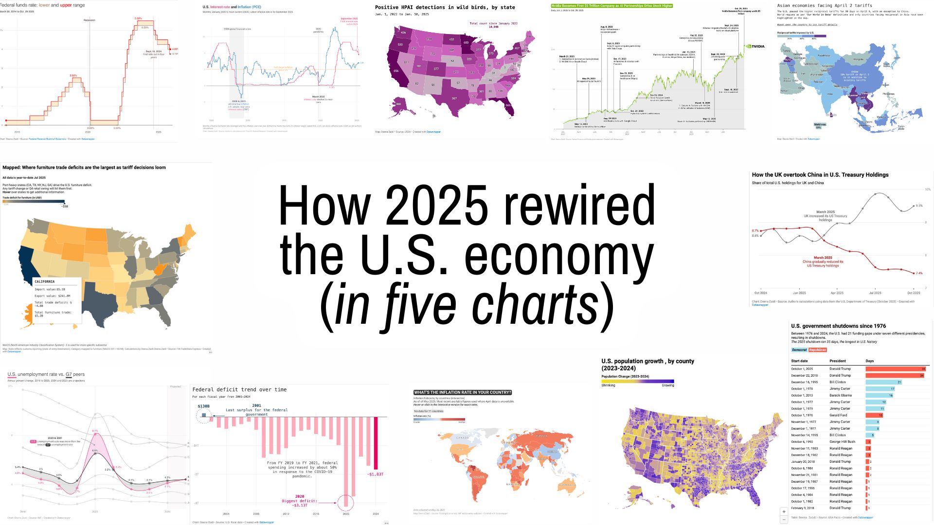
2️⃣ The one with the longest government shutdown
The record shutdown in 2018 was broken in President Trump’s second term in 2025 when the shutdown lasted for a day more than 34 days.
Why this was news? Shutdowns are disruptions when it comes to official data.
Visual explainer: The chart stacked every shutdown since 1976, showing just how long the 2025 lapse was in comparison to the other shutdowns.
3️⃣ The one with the ‘discounted reciprocal’ tariff
On April 2 this year, the U.S. announced “discounted reciprocal” tariffs on countries around the world, including tariffs on some of leading Asian economies like China, India, South Korea and Japan.
Why this was news? The tariff announcement led to reactions from major trading partners such as Canada, Mexico and China. This was also news because these tariffs kept getting revised, making it difficult to quantify the impact.
Visual explainer: Maps and charts focused on trade imbalances and a potential shift in global trade dynamics.
- Follow-up charts looked at US imports that fell sharply, shrinking the deficit to its smallest level since 2023 — one of the few structural reversals of the year.
4️⃣ The one with the reshuffle of America’s debt buyers
2025 wasn’t just about how much debt the U.S. issued — it was about who was willing to hold it.
Why this was news? Emerging economies continued to trim their Treasury exposure, while advanced economies — notably the U.K. and Belgium — stepped in as marginal buyers.
Visual explainer: The bar and line charts traced foreign holdings by country, with a focused comparison of the diverging paths of the U.K. and China.
5️⃣ The one with food inflation (and bananas!)
In 2025, global inflation cooled across certain categories. But food was not one of them.
Why this was news? From eggs to beef to bananas, grocery bills became a visible reminder that tariffs, climate shocks and high rates will eventually catchup in the long run.
Visual explainer: Line charts of specific food prices that spiked including that of beef, eggs and even bananas– but additional factors.